top of page

RENDER WEEKLY
Render Weekly is a movement in the product design industry. @render weekly post weekly design and rendering challenges that a community of designers respond to. The projects shown here are inspired by these challenges. Specifically they are in response to weeks 40, 42, and 44 which were a bottle opener, air purifier, and an object with knobs and buttons respectively. I chose to design an alarm clock with dials and buttons for week 44.
AIR PURIFIER
Anchor 1

I chose to focus on ‘Memphis’ inspired designs for my air purifier to get me out of my comfort zone and make me experiment more with colour pattern and shape. I found it difficult to try to come up with abstract shapes at the beginning of the idea generation process. To help overcome this i used multiple idea generating techniques like drawing irregular shapes and turning them into air purifiers. I decided to developed a sphere with other shapes protruding from the design so that the overall shape would be easily recognised as an air purifier. This is often what Memphis do as most of their products can be recognised as what they are and have additional extravagant colours, shapes, and patterns. They often make the general shape of an object from other geometric forms.

BOTTLE OPENER
Anchor 2

To come up with my bottle opener concept i started off by looking at where examples of line and minimalism exist in everyday life. I used these words and images to generate and develop my ideas. I think that this is reflected in my final outcome in that the shape and all of its parts follow one line of direction. No parts stick out from the the design to ensure that all parts flow seamlessly together and keep the design as minimal and sleek as possible. This is why the bottle opening lip has been created from a cut in the material rather than an additional part which could make the design appear bulky.

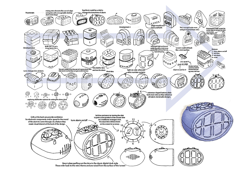
ALARM CLOCK
Anchor 3

For the third brief i wanted to look at some actual products in a specific style similar to what I would be making. This allowed me to explore how I am influenced by the images that I draw from. I wanted to experiment to see how similar my product ended up looking to my starting point. In my opinion they were not very similar although i could see where my designs had been influenced. As the brief was about experimenting with form i wanted to do this as much as possible and didn’t want to be restricted to the amount of rectangular shapes on my reference board. This might have been due to the lack of variety in my chosen images. This taught me that by only referencing to products I was limiting my creativity in development.
bottom of page